

VSCOCAM. A wonderful tool which has gone through many evolutions. It's results are gorgeous...when you know how to use it. As a VSCO fan myself I can attest that I have become numb to the confusing flow, the chic but indecisive icons, and have remained in my VSCO routine. After speaking with several colleagues and friends I was surprised to find (but let's be honest not that surprised) that many had the same methodology when interacting with the app. VSCO really is a beautiful app and I'm sure that many of the design decisions have valid reasons behind them however, lovely sleek VSCO you are not reaching your true potential. So many well-executed tools are inaccessible due to a confusing UI. Many features are completely ignored and at worst discourage potential master users. VSCO, I set out to help you reach your dreams, to help users realize that they can have everything they want in this app world: beauty, smarts, and a whole lot of wonderful film filters and memory capture options.
Objective
The first maneuver in my plan of attack was to see what the pain points of the app are or, in other words, what makes the user want to give up all hope for beautiful mobile pictures. The main challenge with usability testing is user acquisition. Yes, we live in an age in which smart phones are an extension of our hands but there are also so many apps to choose from. With limited time and resources (myself and a very kind friend - thanks Shannon!) I set out to where I knew with certainty I would find VSCO users: San Francisco's Dolores Park. A place which to my east coast eyes isn't much to look at but has become the spot for all millennials and post-millennials, creative or not, to gather after brunches and enjoy the warm weather and somewhat clean grass.

Dolores Park
According to the laws of user-testing-which-cannot-be-broken I sought 7 VSCO users. Most met my image of VSCO users but some, who I was certain would be users had actually never even heard of the app. I wanted to utter "But how can this be?! You're so VSCO! You need this app in your life!" - but I resisted my spokeswomanship.

Art sales at Dolores Park

Test Parameters
Once I correctly identified my users I asked them the following:
"Imagine you're walking on this lovely day and decide to take a picture of something that catches your eye. You want to view the photo on VSCO. What would you do in this situation?"
I had the users narrate their actions aloud. There were two main observations that I made: Most users didn't even use the VSCO camera to capture their image. Instead they used another camera (often their phone's) then imported that captured image into VSCO. When attempting to use the VSCO camera they often couldn't find the camera or even if they did find it they struggled to actually take a photo, becoming confused by the controls. I got some of these lovely quotes:
“Ahhh I think I’m struggling already”
“This one? It’s like maybe it’s the arrow? NO, it is NOT the arrow.”
“Nope, Nope, F*ck

Usability test
Test Tasks
Guerilla Usability Testing Highlights
A: Photo B: Copy, view multiple edits, some wanted to duplicate photo possible feature to add C: Import
Now that my users were nice and comfortable, I asked them the following:
"You like this awesome photo that you've taken but it's not quite right. Edit your photo and see how it compares to the original"
The reactions ranged from "Ok cool. Next?" to:
"This is difficult" "I need some vodka"
My final task was initiated by the following:
"Now you want to edit a photo currently in your phone on VSCO. Can you show me what you would do this without going into your phone gallery directly?"
This went a bit more smoothly since the majority of VSCO users I interviewed currently open non-VSCO photos in VSCO however, most navigate away from the app initially and so this also posed a challenge.
"[The app] needs a bit more clarity, [there are] too many options"
"You made me feel bad app!"
Ultimately many of the pain points were from unintuitive icon and button designs. Many just couldn't find what they wanted and didn't understand what they found. Entire VSCO features were also being completely ignored in the confusion.
THE PAIN POINTS
After reviewing my recordings I identified the following pain points.:
- Camera Icon Location and consistency,
- Nobody knows how to use the camera properly, camera function properties don’t make sense, can’t see - why put effort into camera if no one can use it?
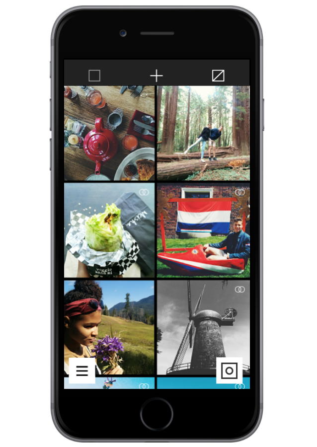
- Top bar library icons are misleading, counter-intuitive, repeat of circle, mark through box
- Copy, Paste icon not communicative in how to properly use
- In photo edit, arrows (undo icons) are not understandable and simply add unnecessary confusion, redesign needed for both; paintbrush and wrench understood, other not
- Disappearing plus sign can often get lost
- Extra functionality of journal, Explore, not used as much because confusion on other pages, want to encourage full use of features but major impediment with icons of main product (editing area) i.e. No one understands, All images or sync button
- Can swipe to navigate from side bar to library but can’t swipe from library to navigation bar
- Navigation error with swiping can’t get back to main library page when explore top buttons, potential for high stress -relief if fix!! Now people are forced to exit the app, then click top picture
- Little side arrow in library when pushed doesn’t take you all the way to the top to see + banner
Although there are many ways that I could take my revamp I decide to tackle the camera functionality. There has obviously been a lot of thought and hard work put into the creation of the VSCO camera. It would be wonderful if it could be made more accessible to users. There needed to be more feedback.
Pain Points to Tackle PHASE 1:
Camera non-existent zoom functionality, camera icon consistency, redefining Image type version icon
Main problem with camera functionality was not having any hint as to how to best use the camera. The symbols are not perfectly intuitive especially for those who are not familiar with traditional camera functions. Users don't immediately recognize that the camera is focusing on an object. I tried to increase this feeling for users by implementing autofocus movement animation.
7/7 times users tried to zoom with the camera using pinch-zoom gestures. Adding in this feature would increase the familiarity users would feel when using the camera. Additionally the exposure and focus individual control features are often ignored due to initial shock and confusion. When you get a handle of them they are wonderful in their customization and intricate control. I really want users of VISCO to take advantage of the wonderfully thought-out camera. By simply giving an indication that the exposure was being adjusted and the focus adjusted users have a better idea about what is going on.

PROTOTYPE Added Zoom Feedback Feature

Not understanding what state the camera is in can be very confusing. A simple state change can give a depth of knowledge that the current design does not. Unless the user is focused on the image itself the changes in focus and exposure can go unnoticed and thus the symbols' functionality. Implementing an indicator icon of Auto-Mode vs manual focus-exposure modes. The symbols used resemble those used in the controls

Before Camera Button Shift

After Camera Button Shift
Another simple fix was to make the camera button centered in terms of the overall camera rather than centered in terms of space next to picture window. The uncentered camera button looked like a mistake to every user and the logic behind the intention was not clear. Overall the adjustment makes for a cleaner image.

Original Camera Button Icon

After Camera Button Clarification
I hope that the added familiarity will encourage users to try out VSCO and explore it even more. It's not scary - I promise.
Special thank you lovely users who agreed to test VSCO. You are awesome.